Creating an appealing menu requires a mixture of research, vision, strategy, creativity and an understanding of your customers’ journeys. It seems such a basic concept – all you’re doing is placing your consumables on a list to help people decide what to purchase, however, your menu actually plays a significant role in your overall branding, the vibe of your coffee shop, and, as mentioned, the customer journey.
The menu should entice, engage, encourage and explain things to your customers, and in order to achieve this, there are many actions you can take.
Do your research
As with any endeavour in the marketplace, it’s crucial to conduct widespread research in order to see both appealing and not-so-appealing menus already out there. With a plethora of images available online for inspiration, there’s no excuse for not knowing where to start when it comes to researching ideas, however, you can’t beat physically investigating other coffee shops to see what they are doing – particularly the popular ones. When you come to create your own menu, you don’t want to be perceived as a copycat lacking originality, yet at the same time, sometimes straying too far away from what other people are doing can be an equally uncomfortable territory; grasping a happy ‘middle ground’ is very important.
Don’t underestimate the power of fonts! This can be an easy thing to overlook but fonts are actually a crucial part of the overall menu feel. They showcase your brand personality as well as reflecting the type of (usual) customers you cater to. For example, a small, chic, modern font would be very appealing to business people, whereas a larger, softer, more rounded font would show older generations that your menu is simple and easily readable for them.
 Physicalise your vision and decipher your customer needs
Once you’ve found menus and concepts that stand out to you, and have collated a colour scheme reflecting your brand and your coffee bean supplier’s, make a vision board of your ideas and inspired thoughts. There’s nothing quite like seeing everything in one place to help you gain clarity and figure out what you want to create.
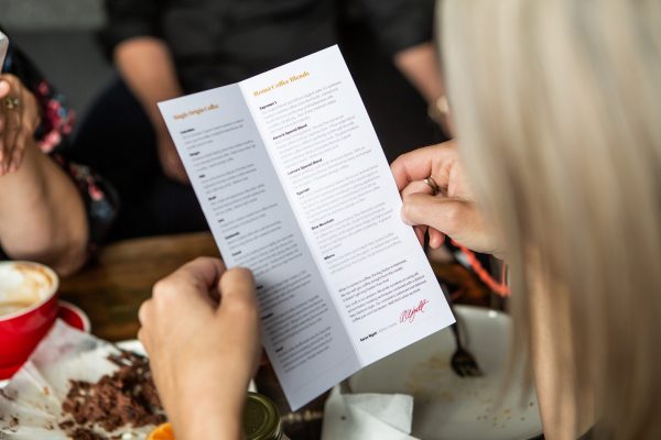
Next up, decide if you need a big coffee menu board or simple print out menus – or both! Think of your customers. They enter your coffee shop – what happens next? Are you hoping they’ll stick around, or are they often on the run and need everything in front of them so their choices can be fast and efficient? Either way, your space needs to reflect and cater to their intentions, and these should flow all the way through to your menu.
When designing a menu, take into account the fact that people read from left to right, top to bottom (in English). Therefore, when thinking about what you want your customers to try, buy, or pay more attention to on your menu, consider where their eyes will naturally go first. The layout of your coffee shop menu can influence how much money your customers spend.
A big question to ask yourself is how much ‘white space’ you’d like on your menu – or, in other words, how simplistic you’d like your food and drink options to be. For example, do you wish to showcase the array of milk you offer after every listed coffee, or would it make more sense for you to have a separate box or list to the left-hand side exploring all of the additional milk options as well as syrups, sweeteners and so on? In some cases, bulking out a menu with repetition of ingredients and menu options can be appealing and exciting, but often with coffee shops, simplicity reigns. Really, what you need to think about is how best to draw your customers’ attention to particular parts of the menu through visual presentation (putting boxes around particular things, adding little graphics, making fonts bigger etc).
 Gaining external influences
It may be worth researching the cost of a qualified artist or graphic designer who could run their eyes over your ideas. They might recommend you include some photos of particular food and drink options to lure people in, and, if you choose to do so, it’s crucial to invest in quality photos to ensure they don’t turn people away from your offerings. If hiring someone external isn’t something you can budget for, your coffee shop menu is an investment, so make sure you find time to get feedback on what you are doing.
Create a variety of coffee shop menus throughout the year
Another great way to create appealing menus is by considering seasonal changes and specials. As the summer comes around, how can you change up your menu to reflect the lighter, cooler options customers are likely to want and crave? Similarly in winter, how can you alter your menu to prioritise the cosiness that comes with a latte? Psychologically, people love the feeling of finding a bargain, so why not jump on this knowledge and offer ‘buy one, get one …’ specials every now and then?
Involve your customers in your business
All things considered, it’s always useful to receive feedback from customers, but also let them know how they can keep up to date with what you are doing and offering. Writing ways for customers to contribute to ideas or give feedback to you at the base of the menu will show that you value your customers and want to keep up with demands. You could even write a comment explaining your rewards system (if you have one!) as another bonus, which will encourage people to come back for more of your menu.
 Measure up costs
Once you have everything in place, look into the cost of mass printing, and get going! Remember, if you’re going for a menu board and a printed menu, they need to align in some way with their layout and feel! Don’t skimp on quality paper and colour – every decision you make will reflect how much care you put into the finer details of your business and ultimately influence how your customers feel about it, too.
So, when it comes to coffee shop menus, don’t overlook the importance of artistic flair – that’s not to say it needs to contain lots of colours and pictures, it’s more about understanding that anything advertising your business, whether it be your logo, display cabinet or menu, should be carefully considered, artistically. People eat with their eyes first, so give them something beautiful to look at. Understand your customers’ needs and enhance their desire to consume your goods by appealing to their senses, visually. Layout, fonts, imagery, colour schemes and selective inclusion and placement of food and drink will influence how much customers decide to spend and help determine their overall customer experience.

 Gaining external influences
 Measure up costs
